
Introduction to Public Health
Surveillance

Surveillance
For persons who need to carry out
surveillance activities but have little
prior experience or training
Also helpful for people who would like
to better understand the process and
reasoning behind surveillance methods
and interpretation

What Is Surveillance?
Centers for Disease Control and
Prevention (CDC): epidemiologic
surveillance is “ongoing systematic
collection, analysis, and interpretation
of health data essential to the planning,
implementation, and evaluation of
public health practice, closely integrated
with the timely dissemination of these
data to those who need to know.”

Why Is Surveillance
Important?
Collecting data is merely one step
Critical goal is to control and/or prevent
diseases
Any data collected must be organized and
carefully examined
Any results need to be communicated to
public health and medical communities

Why Is Surveillance
Important?
Vital to communicate results
During potential outbreak so public health
and medical communities can help with
disease prevention and control efforts
During non-outbreak times to provide
information about baseline levels of
disease
Baseline provides information to public health
officials monitoring health at community level,
serves as reference in future outbreaks

Surveillance Systems
Classified as passive or active
Passive surveillance: local and state health
departments rely on health care providers or
laboratories to report cases of disease
Primary advantage is efficiency: simple and
requires relatively few resources
Disadvantage is possibility of incomplete data due
to underreporting
Majority of public health surveillance systems are
passive

Surveillance Systems
Active surveillance: health department
contacts health care providers or laboratories
requesting information about conditions or
diseases to identify possible cases
Requires more resources than passive surveillance
Useful when important to identify all cases
Example: between 2002 and 2005, active surveillance
used to detect adverse events associated with smallpox
vaccine. (2)

Why Is Surveillance
Important?
Surveillance information has many uses:
Monitoring disease trends
Describing natural history of diseases
Identifying epidemics or new syndromes
Monitoring changes in infectious agents
Identifying areas for research
Evaluating hypotheses
Planning public health policy
Evaluating public health policy/interventions

Why Is Surveillance
Important?
Examples of uses of surveillance data:
Evaluating impact of national vaccination
campaigns
Identifying AIDS when unknown syndrome
Estimating impact of AIDS on US health care
system in 1990s (using mathematical models
based on surveillance data)
Identifying outbreaks of rubella and congenital
rubella among Amish and Mennonite communities
in 6 states in 1990 and 1991 (3)
Monitoring obesity, physical activity,
other indicators for chronic diseases

How to Conduct Surveillance
Surveillance data allow description and
comparison of patterns of disease by
person, place, and time
Several ways to describe and compare
patterns, from straightforward
presentations to statistically complex
analyses
Will concentrate on simple techniques

How to Conduct Surveillance:
Person
When available, demographic characteristics
such as gender, age, race/ethnicity,
occupation, education level, socio-economic
status, sexual orientation, immunization
status can reveal disease trends
Example: looking at
Streptococcus pneumoniae
, a
common cause of community-acquired pneumonia
and bacterial meningitis, examining distribution of
cases by race provides important information
about burden of disease in different populations

How to Conduct Surveillance:
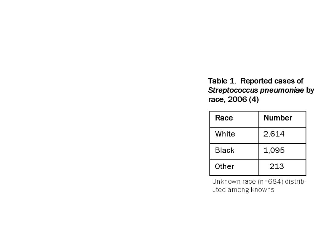
Person – Numbers and Rates
Table 1 shows data
collected on
Streptococcus
pneumoniae
from CDC
Emerging Infections
Program Network, a
surveillance program
that collects data from
multiple counties in 10
US states (4)
How to Conduct Surveillance:
Person – Numbers and Rates
Data show majority of
cases reported among
whites
Can draw only limited
conclusions because race
not recorded for 684 cases
(15%)
Shows only
number
of
reported cases, not
rate
Total number of
individuals by race needed
to determine if there is a
disproportionate burden of
disease among races

How to Conduct Surveillance:
Person – Numbers and Rates
Table 2 shows
same data with
2006 population
estimates of total
number of persons
in each racial
category used to
calculate disease
rates (4)
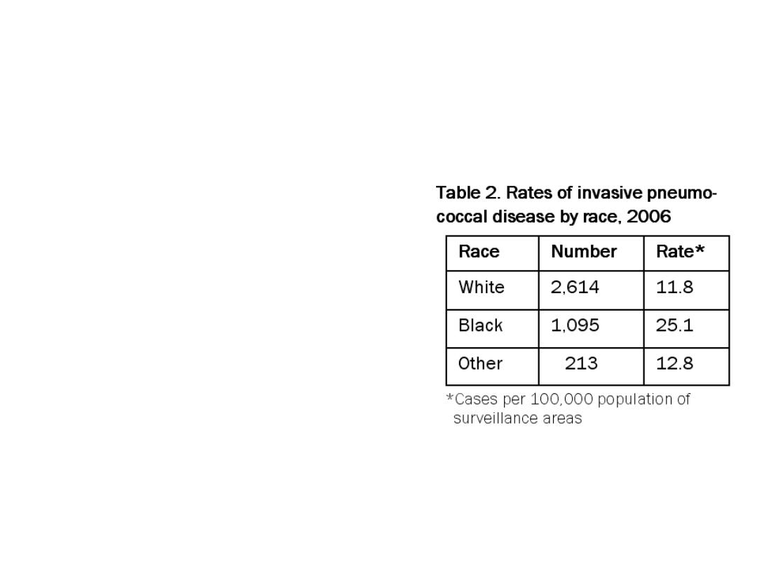
How to Conduct Surveillance:
Person – Numbers and Rates
While Table 1 showed
that whites had the
highest
number
of cases,
Table 2 indicates that
the
rate
of disease was
highest among blacks
Using rates, stratifying
by race provides
information about
disease burden in
different populations
that would not be
apparent from total case
numbers

More on Rates
Rates—A rate is “an expression of the
frequency with which an event occurs in a
defined population”
Using rates rather than raw numbers is
essential to compare different classes of
persons or populations at different times or
places. (5)
Rate = number of events in a specified period
average population during the period

How to Conduct Surveillance:
Place
Best to characterize cases by place of exposure
rather than by place at which cases reported
The two may differ and place of exposure is more
relevant to epidemiology of a disease
Example: travelers on a cruise ship exposed to a disease just
prior to disembarking but become symptomatic and are
diagnosed after return to various home locations
Example: person exposed to disease in small rural town but
referred to tertiary care center 100 miles away where
disease is diagnosed and reported

How to Conduct Surveillance:
Place – Presenting Data
Data by geographic location can be presented
in a table
Also helpful to use maps to facilitate
recognition of spatial associations in data
See
FOCUS
Volume 5, Issue 2: Mapping for
Surveillance and Outbreak Investigation for
discussion of maps and visual presentation of
information
Inferential analysis can also be done using
multilevel modeling, other statistical methods

How to Conduct Surveillance:
Place – Modeling Resources
Modeling of surveillance data by place is
beyond scope of this issue
Resources for further information:
Centers for Disease Control and Prevention.
Resources for creating public health maps.
http://www.cdc.gov/epiinfo/maps.htm
. Updated
August 14, 2008. Accessed August 22, 2008.
Clarke KC, McLafferty SL, Tempalski BJ. On
epidemiology and geographic information
systems: A review and discussion of future
directions.
Emerg Infect Dis
. 1996; 2(2):85-92.

How to Conduct Surveillance:
Place – Spot Maps
Spot maps: maps on which a dot or symbol marks a
case of disease
Made by indicating exposure locations of reported
cases of disease on hard copy map with pins or
colored pen
Or with geographic information systems (GIS)
Computer programs designed for storing, manipulating,
analyzing, and displaying data in a geographic context
Very useful for mapping surveillance data by place
Epi Map (part of Epi Info™) can be downloaded for free at
How to Conduct Surveillance:
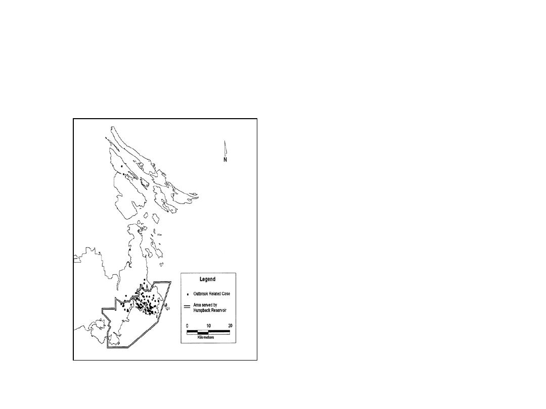
Place – Spot Maps
Example: spot map used to
show geographic spread of
cases in 1995 outbreak of
toxoplasmosis thought to be
associated with a municipal
water system in British
Columbia, Canada (5)
Spot maps show geographic
distribution of cases but not
population size at each
location, so should not be
used to assess disease risk

How to Conduct Surveillance:
Time
Compare number of cases reported in time
period of interest (weeks, months, years) to
number of cases reported during similar
historical period
Usually a delay (sometimes months to years)
between disease onset and date when
disease is reported, so preferable to use date
of onset, if available, rather than date of
report

How to Conduct Surveillance:
Time – Line Graphs
Especially helpful for examining data not
likely to have much short term variation
Example: there is limited variation in number of
AIDS cases reported each month
Provide valuable qualitative information;
disease outbreaks often obvious from visual
inspection of data, may not require a
quantitative analysis
How to Conduct Surveillance:
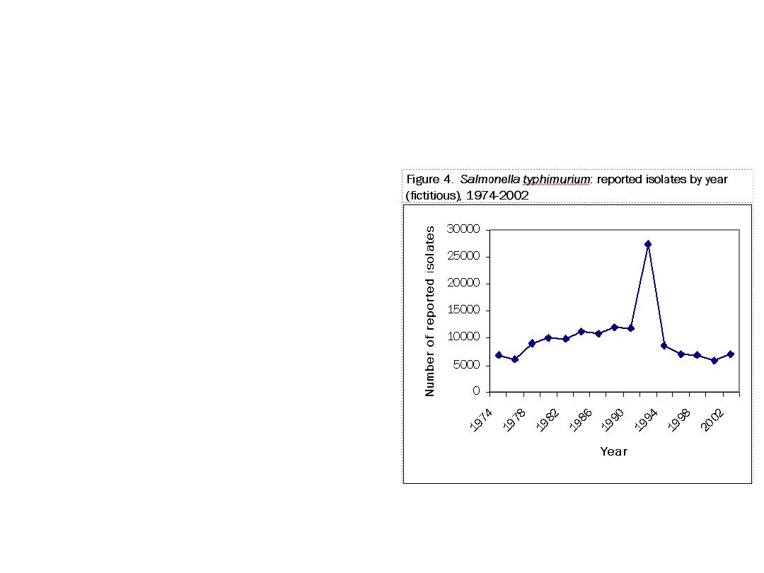
Time – Line Graphs
Example of line graph
using fabricated data:
reported cases of
Salmonella
typhimurium
for 2-year
time intervals from
1974 to 2002
Spike in 1994
indicating outbreak of
S. typhimurium
obvious without
quantitative analysis

How to Conduct Surveillance:
Time – Incidence Rates
May use line graph to plot incidence rates
Incidence rate is number of new cases that occur
during a specified time interval in a population at risk
for developing the disease
Number of new cases may be used as a proxy for overall
disease occurrence
Value often multiplied by 1,000 or 100,000 to improve
interpretability
Reporting incidence
rates
rather than
numbers
particularly important if population has changed in
size or characteristics
Example: addition of towns to a surveillance region has
increased population size, or influx of migrant workers has
significantly changed the demographics

Standardization
Rate made up of numerator and denominator
Surveillance data often numerator data (number of
cases reported in time period)
Utility of these raw numbers is limited because do not take
into account size of population or distribution of
demographic factors such as age or gender
Rates allow more meaningful comparisons over time
within a population, among subpopulations, or
between populations
Rates take into account size of the population and time
period involved (3)

Standardization
Crude rates often calculated using surveillance data
Number of events of interest (such as reported cases
of disease) for a specific period of time for the entire
population
Only appropriate to compare crude rates if
populations are similar with respect to factors related
to disease of interest, such as age, gender, race
Example: would be inappropriate to compare rate of
prostate cancer in population with high proportion of elderly
men to rate in another population with mostly young men,
since risk of prostate cancer increases with age

Standardization
Standardization used to remove effects of differences
in confounding variables such as age when
comparing two or more populations
Results in adjusted rates
Is particularly useful when comparing rates in different
populations (e.g., comparing state data to national data)
when comparison of crude rates may be misleading if
populations differ on key variables
Most common technique uses weighted average rates
specific to potential confounding variables, based on
specified distribution of the variables (5)

Data Presentation
Surveillance data must be presented in way
that is easy to understand and interpret
Many ways to display surveillance data: (3)
Line graphs for displaying data by time
Maps for presenting data in geographic context
Graphical displays such as histograms, frequency
polygons, box plots, scatter diagrams, bar charts,
pie charts, or stem-and-leaf displays
Spot or chloropleth maps
Single/multivariable tables

Data Presentation
The choice of a particular graph or table
depends on type of data, but presentation
should be simple and easy to follow
Should provide all information necessary to
interpret the figure without referring to text
Include concise title that describes subject or
disease, time, place (when relevant)
Define any abbreviations or symbols
Note any data exclusions (3)
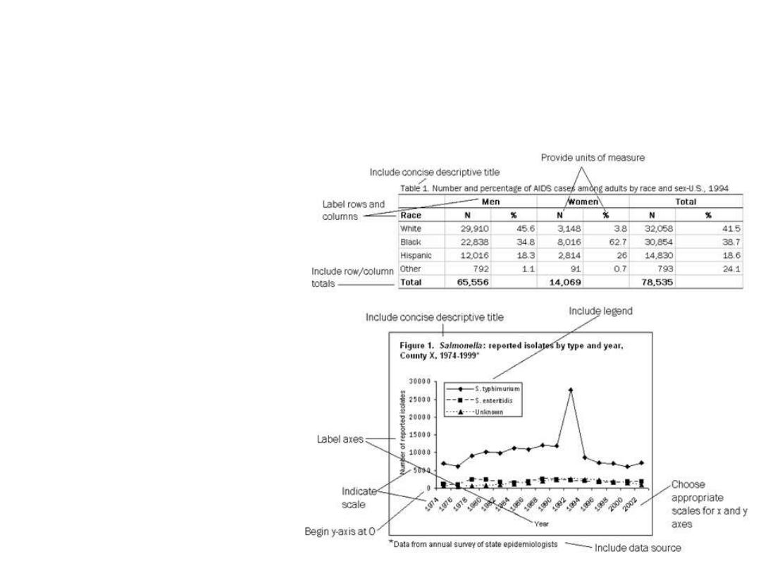
Data Presentation
Additional
display
guidelines
for tables
and graphs

Conclusion
Surveillance is valuable epidemiologic
tool that can serve many purposes
When surveillance data is collected,
analyzed, interpreted, reported
appropriately, these data can provide
important information about disease
patterns to inform public health practice
and policy