Lecture IV
Presentation
of data
BY
Lecturer
Dr. Aliaa Makki
Department of Community
Medicine
2014-2015

Objectives
By the end of this lecture you‘ll be able to:
1.
Draw graphs; histogram, frequency polygon,
bar chart, line graph, time series graph,
scattered diagram& pie chart.
2.
Understand the concept of pictorial
presentation, flow chat, map chart

Presentation of Data
1-Mathmatic presentation.
2-Tabular presentation
(Frequency distribution)
Qualitative
Quantitative
3-Graphical presentation
Histograms
Frequency polygon
Bar charts (Bar graphs)
Pie charts (Pie graphs)
Time series graphs
4-Pectorial presentation

2-Tabular presentation:
Presentation of data in
tables
so as to organize
them into a compact, concise & readily
comprehensible form.
They can display the characteristics of data
more efficiently than the raw data.
There are various ways of organizing and
presenting data; simple tables &graphs,
however, are still very effective methods.
They are designed to help the reader obtain
an intuitive feeling for the data at a glance.
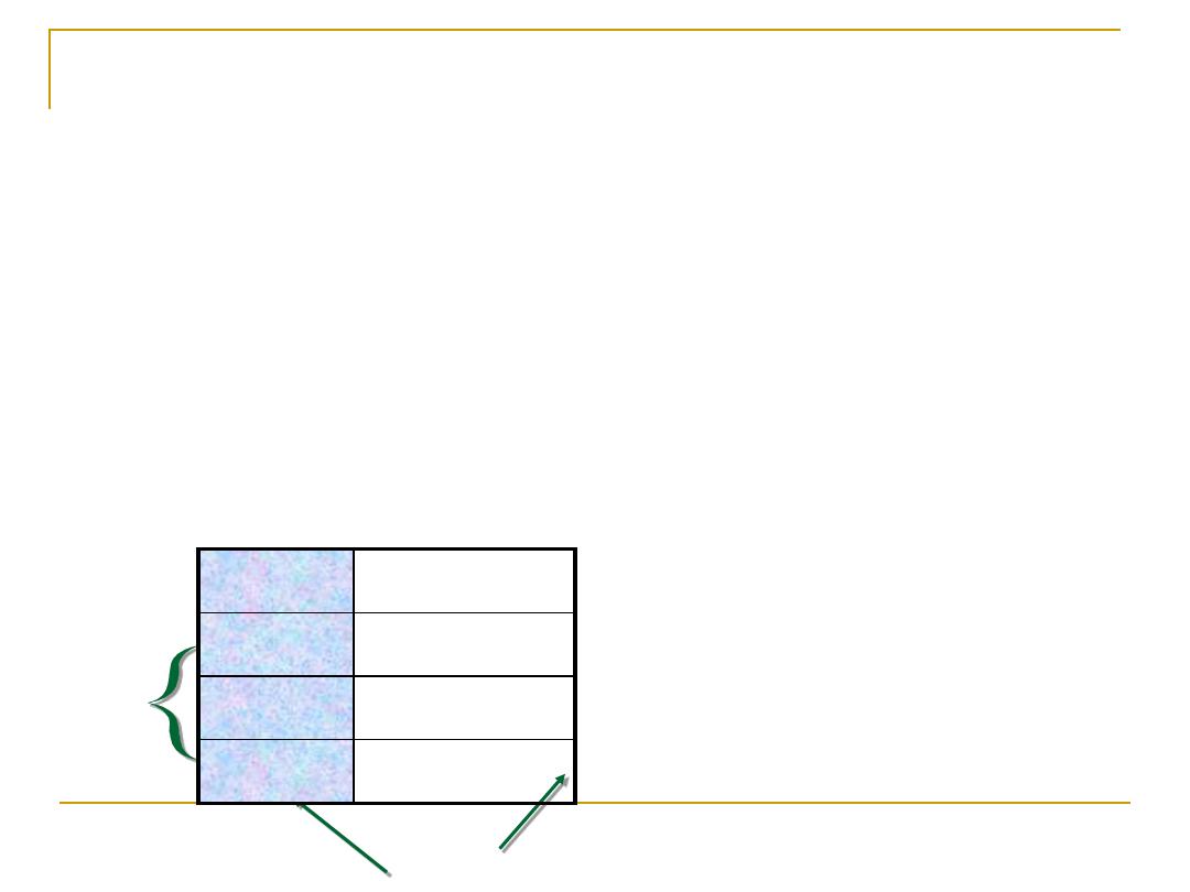
Tabular Presentation (Tables):
Table
consists of row(S) & column(S), could be 2x2,
2x3.---,or as a
List
which is the simplest form of table,
consists of two columns only, the first giving an
identification of the observation unit and the second
giving the value of the variable of that unit.
Rows
column
class frequency
15-24
3
25-34
5
35-44
2

Criteria of the Proper Table:
a- As
simple
as possible (it is better to have 2-3
simple tables than one complicated).
b-
Understandable
&
self explanatory
without
references to the text. This is done by:
►
The
title should be clear
(placed above
the table), and answer the questions of:
What? Where? And When?
►
Each
row and column should be labeled
clearly and concisely.

►
Specific unit
of the measure for the data should
be defined.
►
Total
should be placed.
►
Illustrate symbols, code, and abbreviation
by putting a
footnote below
the table.
c-
Source
of the table (if not original).
d-
Avoid
too much over ruling.

Table 1: Normal B.Wt of total birth (what), England (where),
1969-1970 (when).
Total
Mother's age (years)
Parity
≥30
<30
564,003
817,973
87,110
49,895
234,084
64,894
514,108
583,889
22,216
0
1-3
≥4
1,469,089
348,873
1,120,213
Total (all parity)
Source. Osborn J.F., (1975). J.R statistic. 24, 75-84.

Types of Tables:
Simple Table :
i
ncluding
one
variable (quantitative
or qualitative ) and the corresponding frequency
Cross tabulation
:
Two
–dimensional tables:
two
variables are cross
classified
Three-dimensional tables:
three
variables are
cross-classified (eg. outcome of treatment by age
and sex)
Contingency table:
demonstrating the
relationship between
two or more
variables.
observations on a number of categorical variables
are cross-classified.

3-Graphical and Pictorial presentation
of data:
The use of
diagrams
or
pictures
to
display distribution or characteristics of
one or more sets of data
in a compact
and readily comprehensible form.
They can provide a better visual
appreciation of characteristics of data
than tabular presentation.

Graphs:
It is a
pictorial
display of
quantitative data
using
a coordinate system , where the X is the
horizontal axis and the Y is the vertical axis.
X-axis usually includes the
independent
variable
(method of classification)
Y-axis includes the
dependent
variable
(
frequency or relative frequency
or other indicator)

General Principles:
1.
Simple,
no more lines or symbols should be
used in a single graph than the eye can follow.
2.
Self-explanatory.
3. The title should
answer the questions of what, where
&when?
4.
The title
can be placed at the
top
, or at the
bottom
of
the graph.
5. When more than one variable or relation is shown on
a graph, each should be differentiated clearly by a
“key”
6. Source, if it's not original.
7.
Scale divisions
and the units into which the scales is
divided should be indicated clearly.

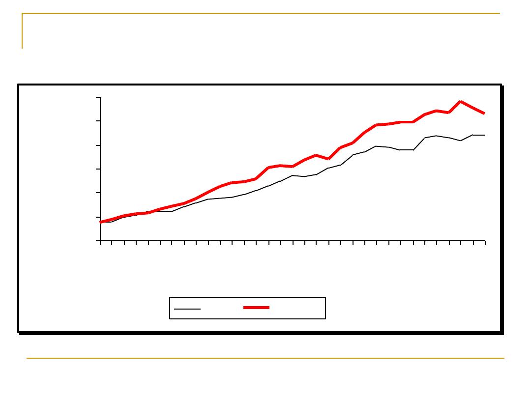
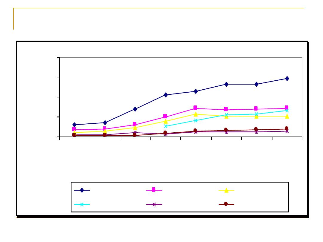
Arithmetic scale line graph:
This is particularly beneficial to present the
trend of one or more sets of data.
In general the
Y-axis is 2/3
the X-axis
An
equal distance represents an equal
quantity
anywhere on an axis.
The
slop of the line indicates the rate of
increase or decrease
Two or more lines following a parallel path
indicate
identical rates
of increase or
decrease
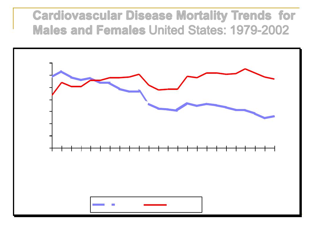
Cardiovascular Disease Mortality Trends for
Males and Females
United States: 1979-2002
Source: CDC/NCHS.
380
400
420
440
460
480
500
520
79
81
83
85
87
89
91
93
95
97
99
01
Years
D
e
a
th
s
i
n
T
h
o
u
s
a
n
d
s
Males
Females
Hospital Discharges for Congestive Heart
Failure by Sex
United States: 1970-2002
Note: Hospital discharges include people living and dead.
Source: CDC/NCHS.
0
100
200
300
400
500
600
70 72 74 76 78 80 82 84 86 88 90 92 94 96 98 00 02
Years
D
is
c
h
a
rg
e
s
i
n
T
h
o
u
s
a
n
d
s
Males
Females
Trends in Cardiovascular Operations & Procedures
United States: 1979-2002
Source: CDC/NCHS.
0
500
1000
1500
2000
79
80
85
90
95
00
01
02
Years
Pr
o
c
e
d
u
r
e
s
i
n
T
h
o
u
s
a
n
d
s
Catheterizations
Open-Heart
Bypass
PTCA
Endarterectomy
Pacemakers
80
82
84
86
88
90
92
94
96
Calender years 19--
0
200
400
600
800
1000
1200
A
v
e
ra
g
e
a
n
n
u
a
l
e
v
e
n
t
ra
te
p
e
r
1
0
0
0
0
0
Men
80
82
84
86
88
90
92
94
96
Calendar years 19--
0
200
400
600
800
1000
1200
A
v
e
ra
g
e
a
n
n
u
a
l
e
v
e
n
t
ra
te
p
e
r
1
0
0
0
0
0
Men
FIN-NKA
AUS-NEW
AUS-PER
BEL-CHA
BEL-GHE
CAN-HAL
CHN-BEI
DEN-GLO
FIN-KUO
FIN-TUL
FRA-LIL
FRA-STR
FRA-TOU
GER-AUG
GER-BRE
GER-EGE
ICE-ICE
ITA-BRI
ITA-FRI
LTU-KAU
NEZ-AUC
POL-TAR
POL-WAR
RUS-MOC
RUS-MOI
RUS-NOC
RUS-NOI
SPA-CAT
SWE-GOT
SWE-NSW
SWI-TIC
SWI-VAF
UNK-BEL
UNK-GLA
USA-STA
YUG-NOS
80
82
84
86
88
90
92
94
96
Calender years 19--
0
50
100
150
200
250
300
350
A
v
e
ra
g
e
a
n
n
u
a
l
e
v
e
n
t
ra
te
p
e
r
1
0
0
0
0
0
Women
80
82
84
86
88
90
92
94
96
Calendar years 19--
0
50
100
150
200
250
300
350
A
v
e
ra
g
e
a
n
n
u
a
l
e
v
e
n
t
ra
te
p
e
r
1
0
0
0
0
0
Women
AUS-NEW
AUS-PER
BEL-CHA
BEL-GHE
CAN-HAL
CHN-BEI
CZE-CZE
DEN-GLO
FIN-KUO
FIN-NKA
FIN-TUL
FRA-LIL
FRA-STR
FRA-TOU
GER-AUG
GER-BRE
GER-EGE
ICE-ICE
ITA-BRI
ITA-FRI
LTU-KAU
NEZ-AUC
POL-TAR
POL-WAR
RUS-MOC
RUS-MOI
RUS-NOC
RUS-NOI
SPA-CAT
SWE-GOT
SWE-NSW
UNK-BEL
UNK-GLA
USA-STA
YUG-NOS
G14

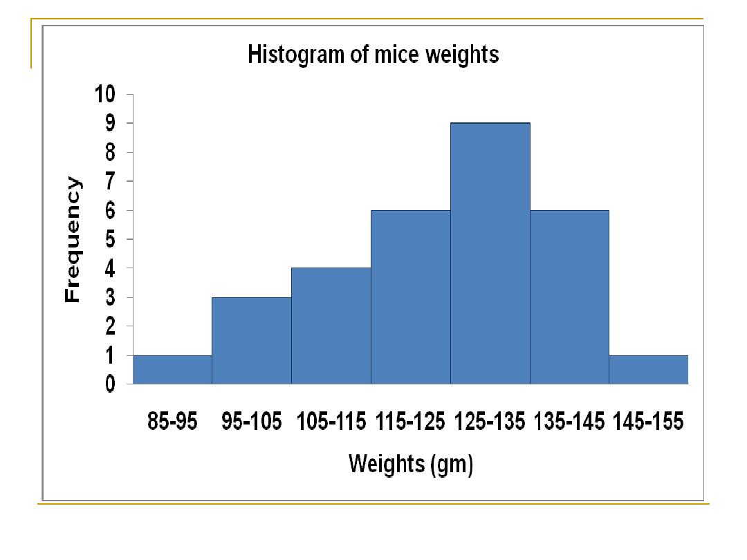
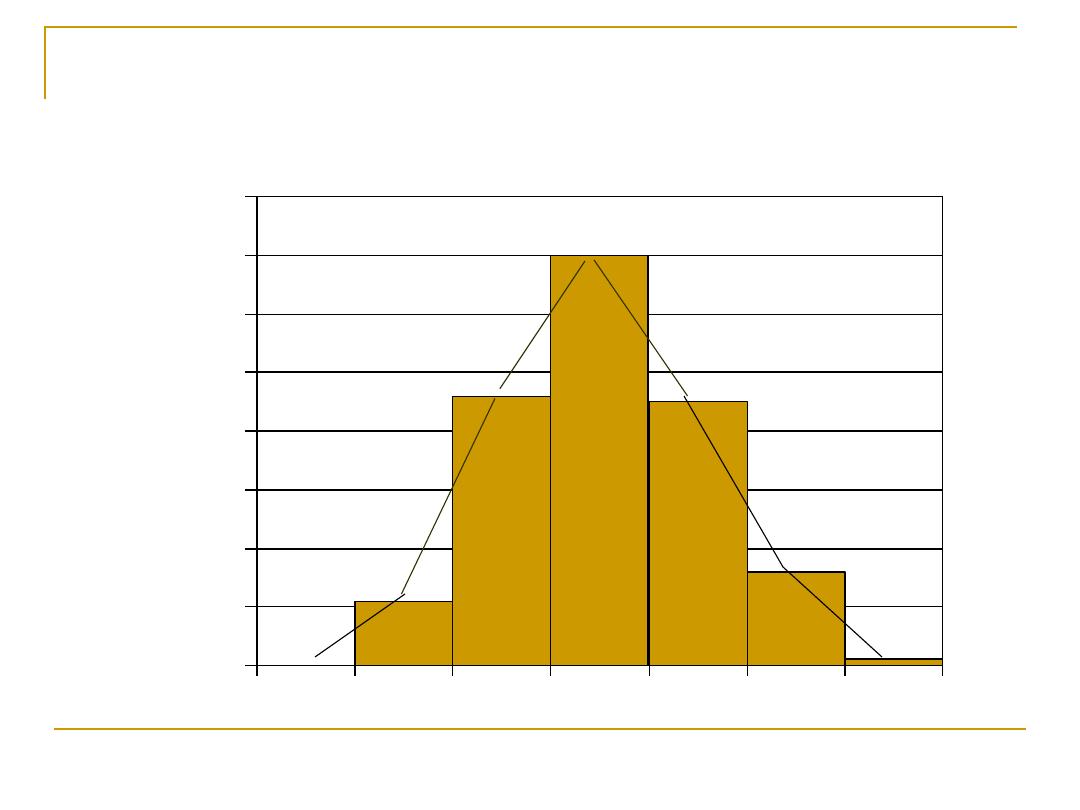
Histogram:
This is a graphical presentation of
frequency
distribution
in which:
The rectangle proportional in the area to the
frequencies are erected on the
horizontal axis
.
The base lines are continuous (because we are
dealing with
continues variables
).
The
width
of the rectangles should be
equal
.
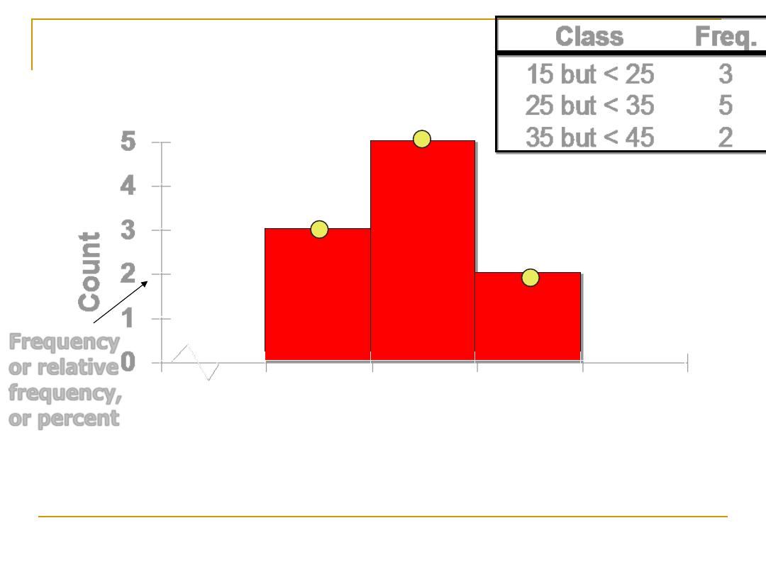
0
1
2
3
4
5
Co
u
n
t
Class
Freq.
15 but < 25
3
25 but < 35
5
35 but < 45
2
0 15 25 35 45 55
Frequency
or relative
frequency,
or percent
Histogram
Graphical display of
frequency distribution
of
quantitative
variable .
The
values
of the
quantitative variable(as
class interval) will be
placed on the
X-axis
(representing the width
of the rectangles), and
the corresponding
frequency (or relative
frequency)
will be
placed on the
Y-axis
(representing the height
of the rectangles)
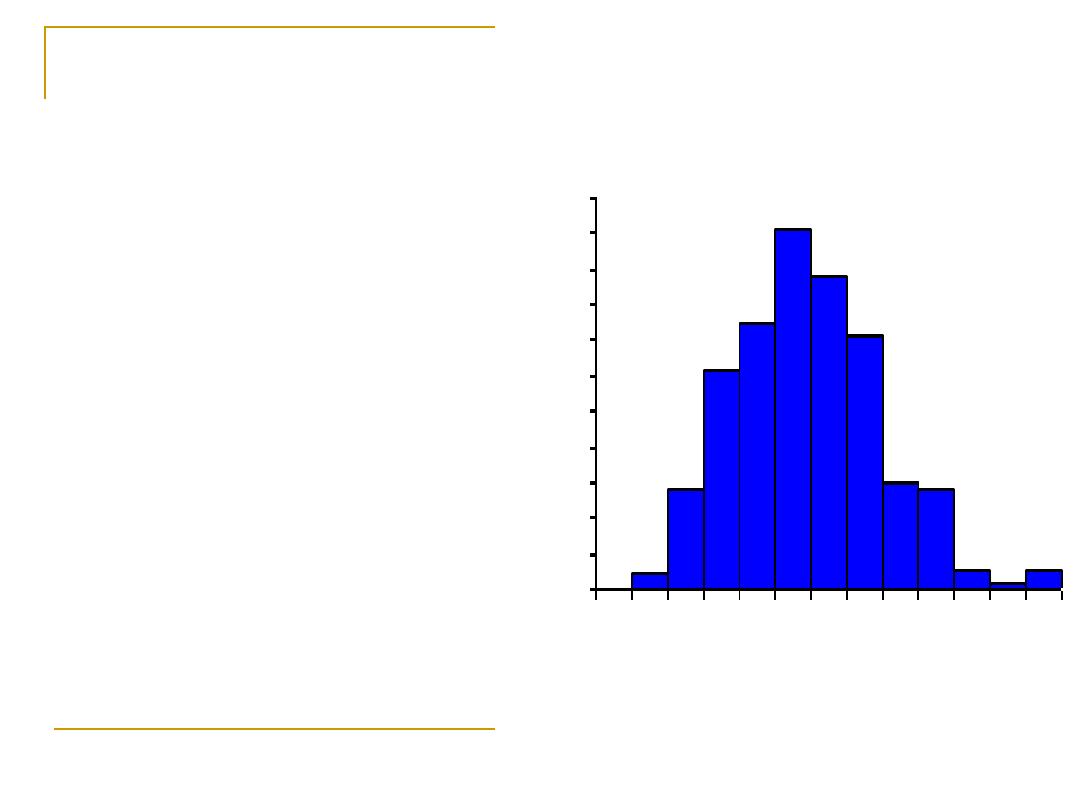
Histogram of serum uric acid distribution
in 267 healthy males
0
2
4
6
8
10
12
14
16
18
20
22
2
.5
-
2
.9
3
.5
-
3
.9
4
.5
-
4
.9
5
.5
-
5
.9
6
.5
-
6
.9
7
.5
-
7
.9
8
.5
-
8
.9
Uric acid (mg/dl)
P
e
r
c
e
n
t
F
r
e
q
u
e
n
c
y

Criteria of Histogram:
The area is
proportional to the height, and the
frequencies
in different categories can be
directly compared by examining the relative
height of the respective bar.
It is important that the
class interval should
be equal,
otherwise the area should be
compared.
Only
one set
of data can be shown in one
histogram
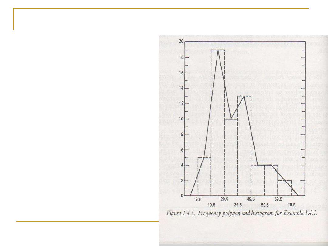
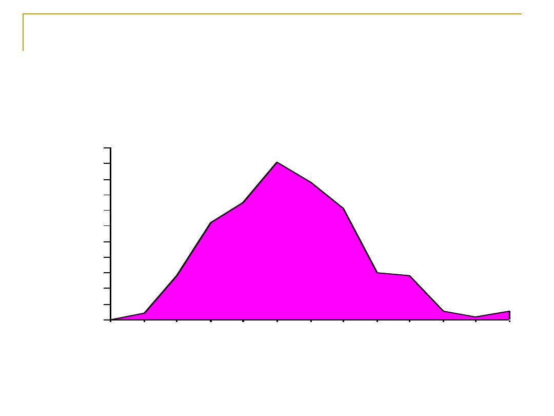
Frequency Polygon
:
Another form of
graphical
presentation
of frequency distribution
of
quantitative variables
.
It is similar to the
histogram, but instead
of using rectangles to
present data, the
midpoint of the top of
each rectangle are
plotted, and connected
together by straight
lines.
Frequency Polygon
More than one set
can be
demonstrated on the
same graph, to direct
comparison.
It is only appropriate when the
variables on the horizontal axis
are
continues
.
It provides information about
underlying characteristics of
data .
The area under the frequency
polygon is
equal
to the area
under the equivalent
histogram.
Number of students by sex majoring in each of
five academic areas
50
150
250
350
450
B
.A
d
m
in
.
E
d
uc
a
tio
n
H
u
m
a
n
iti
es
S
ci
e
n
ce
S
o
ci
a
l s
ci
en
c
e
Academic Areas
N
o
.
o
f
S
t
u
d
e
n
t
s
Female
Male
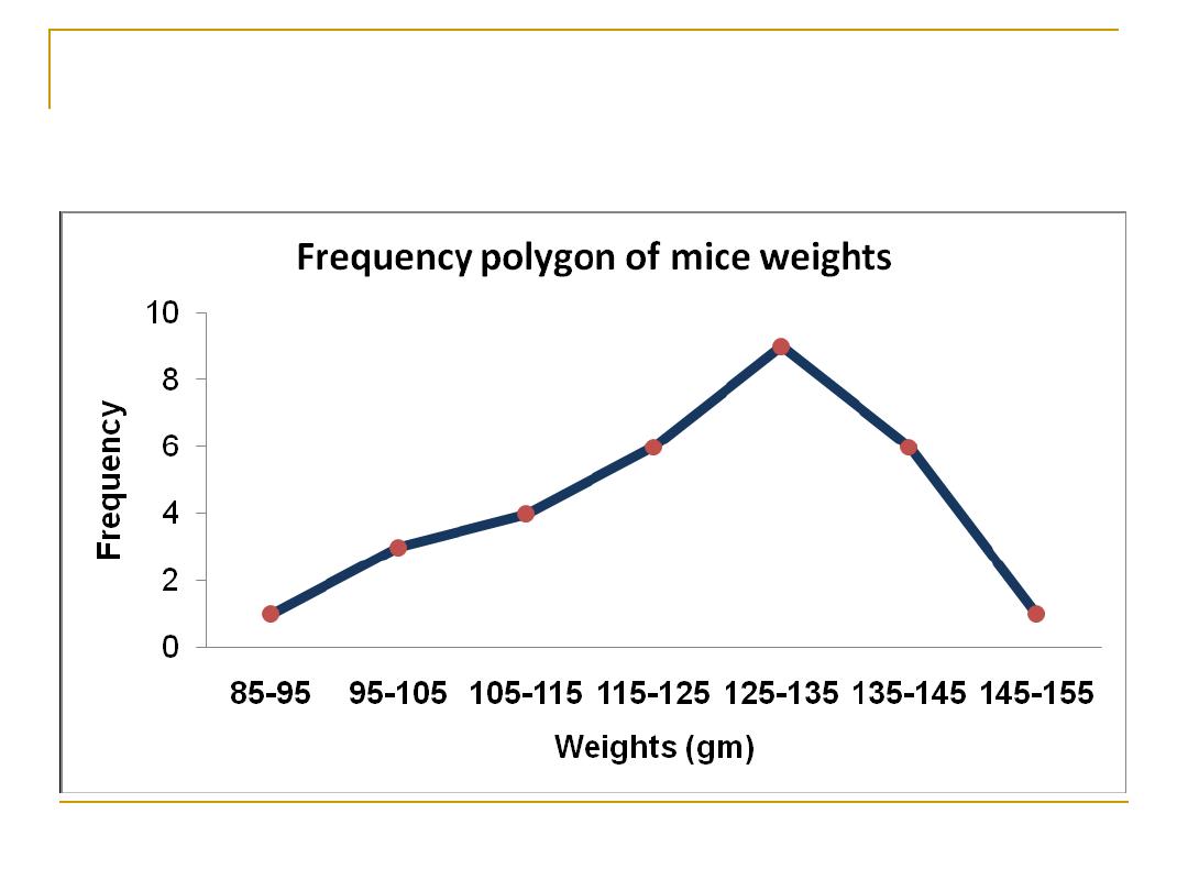
Frequency Polygon
Representing the grouped frequency table using
the Polygon
0
10
20
30
40
50
60
70
80
34.5
44.5
54.5
64.5
74.5
84.5
Frequency Polygon
Frequency Polygon of serum uric acid
distribution in 267 healthy males
0
2
4
6
8
10
12
14
16
18
20
22
2.
5-
2.
9
3-
3.
4
3.
5-
3.
9
4-
4.
4
4.
5-
4.
9
5-
5.
4
5.
5-
5.
9
6-
6.
4
6.
5-
6.
9
7-
7.
4
7.
5-
7.
9
8-
8.
4
8.
5-
8.
9
Uric acid (mg/dl)
Pe
rc
en
t F
re
qu
en
cy
Numerical
Data Presentation
Numerical data
Order array
Frequency distribution
histogram
polygon
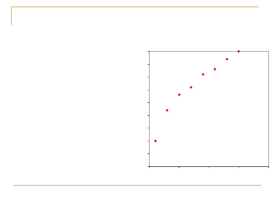
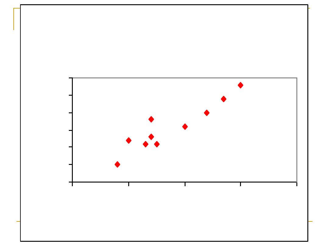
Scatter diagram
:
A pair of
measurements is
plotted as a
single
point on a graph
.
The value of one
variable of each pair
is plotted on the X
axis and the value of
the other variable is
plotted on the Y axis
Scatter diagram show the relation between
age & weight (Hypothetical data)
0
5
10
15
20
25
30
35
40
45
0
5
10
15
20
Age in years
W
e
ig
h
t
in
K
g
m
Showing the relation
A single and effective form to examine the
relation between
two quantitative
variables is
using a scattered points graph.
Each point correspond at
one
subject.
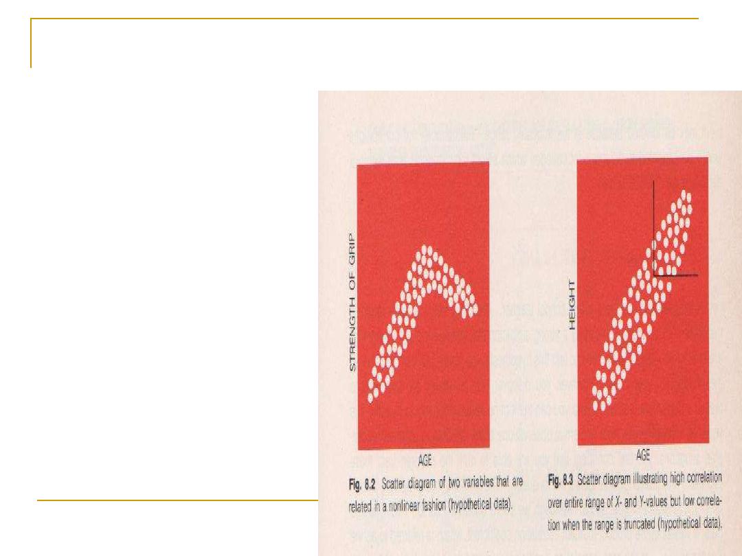
Scatter diagram
The pattern is
indicative of the
relationship between
two variables, which
might be
linear
(if
they follow straight
line) or
curvilinear
(if the pattern
doesn't follow
straight line)
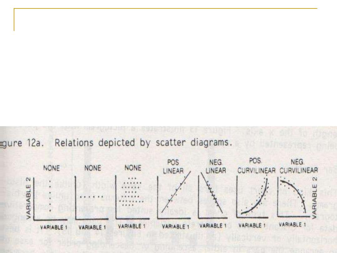
A scatter diagram could suggest:
No relationship:
when one variable changes with no change
in the other variable ,or when the pattern is
buzzard
Linear relationship
: an increase in the 1st variable is
associated with an increase
(positive
) or decrease
(negative)
in the 2nd variable, and the pattern
follows a straight line.
Curvilinear
(
positive or negative
) relationship: the pattern of
increase or decrease will
not follow a straight line .
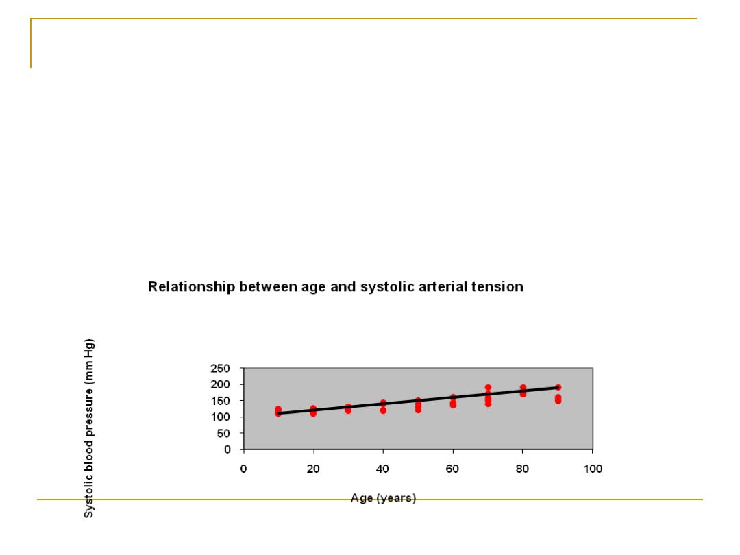
correlation of two methods of cardiac
output measurments
0
0.5
1
1.5
2
2.5
3
0
1
2
3
4
l/min
l/
m
in

Charts:
These are
pictorial
methods of presenting
statistical information .
They can convey many different types of
information as lengths, proportion,
geographical distribution, and special
relationships.

Diagrammatic "Graphical“ or "Figure“:
For categorical data
Bar chart;
This is a graphical presentation of
the
(relative) frequencies
or magnitudes by
rectangles of constant width drawn with length
proportional to the (relative) frequencies or
magnitudes concerned.

Bar chart:
Used to present
discrete or qualitative
data
It includes
separated bars
of
equal width
The method of classification of the variable is
usually placed on the X-axis, and the Y-axis
usually represents the corresponding
frequency or relative frequency.

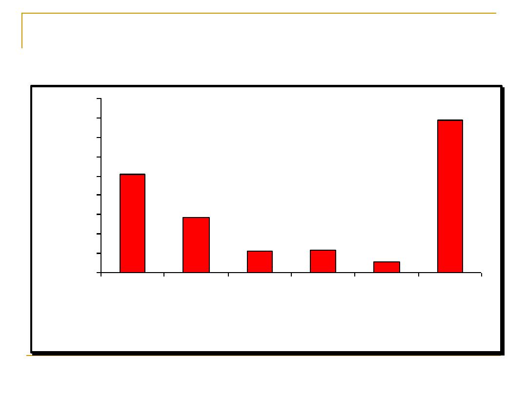
Criteria of Bar chart:
It can be used to present
more than one set
of data simultaneously using different colors,
shades,... In this case a
key
should be used
Comparison
will be made on the basis of the
height of the bar (frequency). i.e.:
the width
of the bar has no value
It is important that the vertical axis should
start at the zero
, otherwise the heights of the
bars are not proportional to the frequencies.
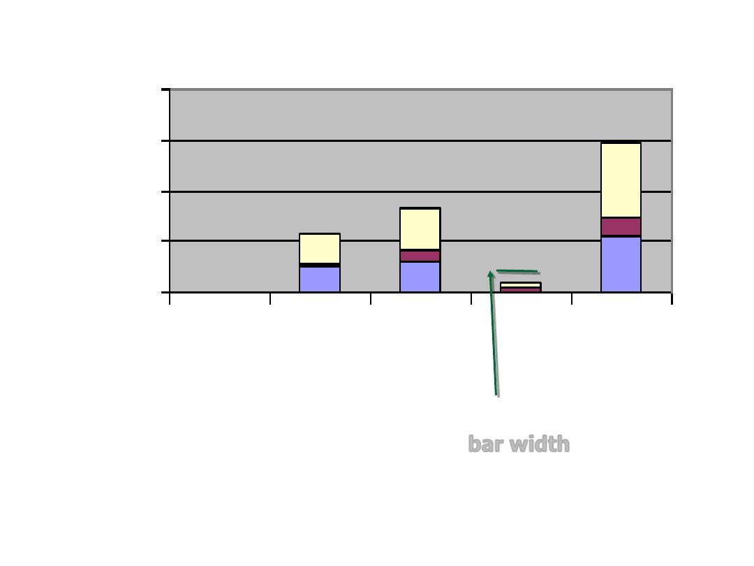
Ligitimate baby,England,1965-1970
0
1000000
2000000
3000000
4000000
0
1-3
≥4 Total (all
parity)
Parity
N
o
.o
f
w
o
m
e
n
bar width
Representing the simple frequency table
using the bar chart
Number of decayed teeth
5.00
4.00
3.00
2.00
1.00
.00
F
re
q
u
e
n
c
y
6
5
4
3
2
1
0
2
2
5
4
2
1
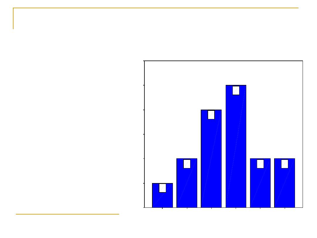
We can represent
the simple
frequency table
using the bar
chart.
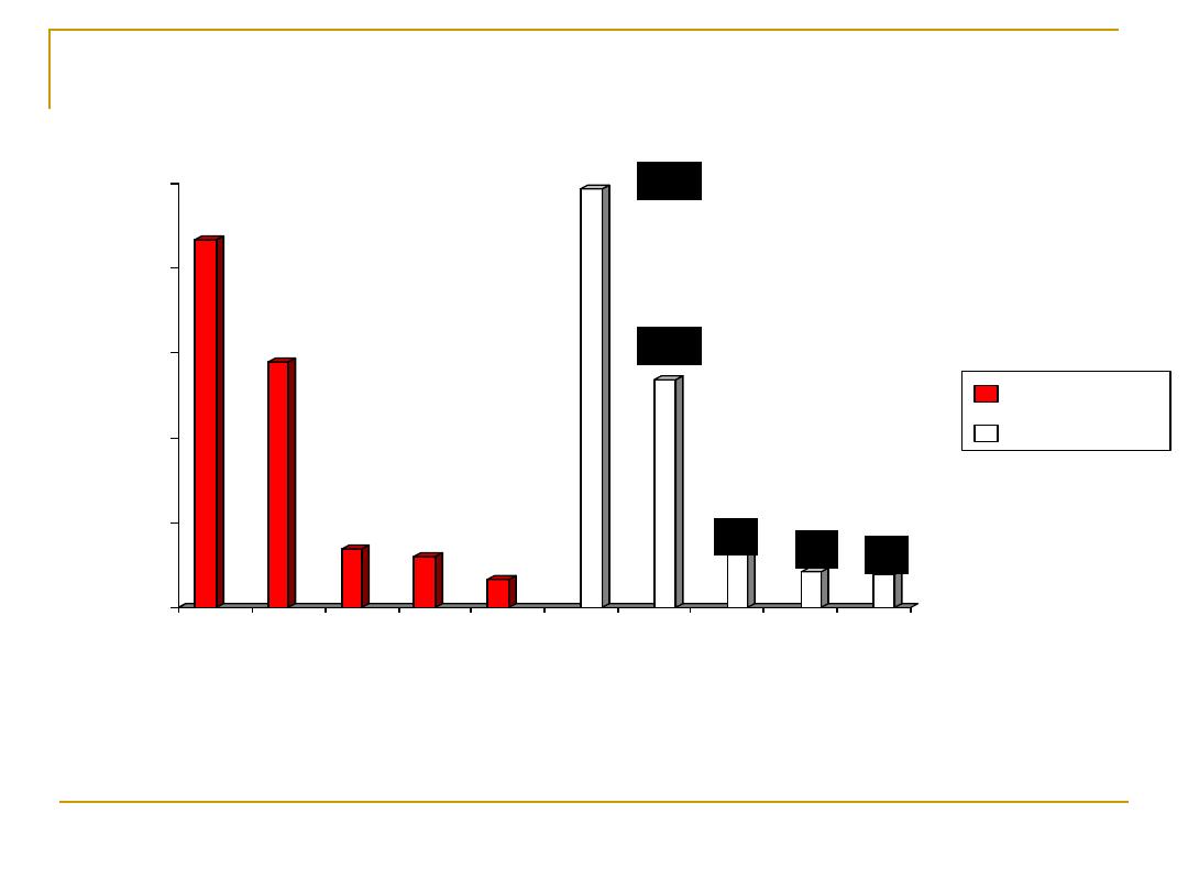
Estimated Direct and Indirect Costs of Cardiovascular
Diseases and Stroke
United States: 2005
Source: Heart Disease and Stroke Statistics – 2005 Update.
254.8
142.1
56.8
59.7
27.9
393.5
0
50
100
150
200
250
300
350
400
450
H
e
a
rt
D
is
e
a
s
e
C
o
ro
n
a
ry
H
e
a
rt
D
is
e
a
s
e
S
tr
o
k
e
H
y
p
e
rt
e
n
s
iv
e
D
is
e
a
s
e
C
o
n
g
e
s
ti
v
e
H
e
a
rt
F
a
ilu
re
T
o
ta
l
C
V
D
*
B
il
li
o
n
s
o
f
D
o
ll
a
rs
434
289
69
61
34
494
269
64
42 39
0
100
200
300
400
500
A
B
C
D
E
A
B
D
F
E
Males
Females
Deaths in Thousands
Leading Causes of Death for All Males and Females
United States: 2002
A Total CVD
(Preliminary)
B Cancer
C Accidents
D Chronic Lower Respiratory Diseases
E Diabetes Mellitus
F Alzheimer’s Disease
Source: CDC/NCHS
Distribution of coronary risk factors among patients
with chronic metabolic syndrome
48.8
27.5
53.8
66.3
93.1
17.5
0
10
20
30
40
50
60
70
80
90
100
R
el
at
iv
e
fre
qu
enc
y
(%
)
Hy
pe
rte
ns
ion
Dia
be
tes
M
ell
itus
Fa
mi
ly
his
tor
y of
is
che
mi
c H
ea
rt
Di.
..
Sm
ok
ing
ha
bit
Dy
sli
pide
mi
a
Obe
sit
y
Fig 3: Distribution of unvaccinated children below one year by governorates
0%
5%
10%
15%
20%
25%
30%
35%
B
a
gh
da
d
A
n
ba
r
B
a
byl
on
W
ass
it
B
a
sr
a
h
N
in
eva
h
M
iss
a
n
Q
a
di
si
ya
D
iya
la
K
e
rb
al
a
T
aa
m
e
m
M
ut
h
an
a
T
hi
q
ar
N
aj
af
S
a
la
h
A
l D
in
S
u
le
im
a
ni
ya
E
rb
il
D
uh
ok
T
ot
al
Governorates
%
o
f
u
n
v
a
c
c
in
a
te
d
c
h
il
d
re
n
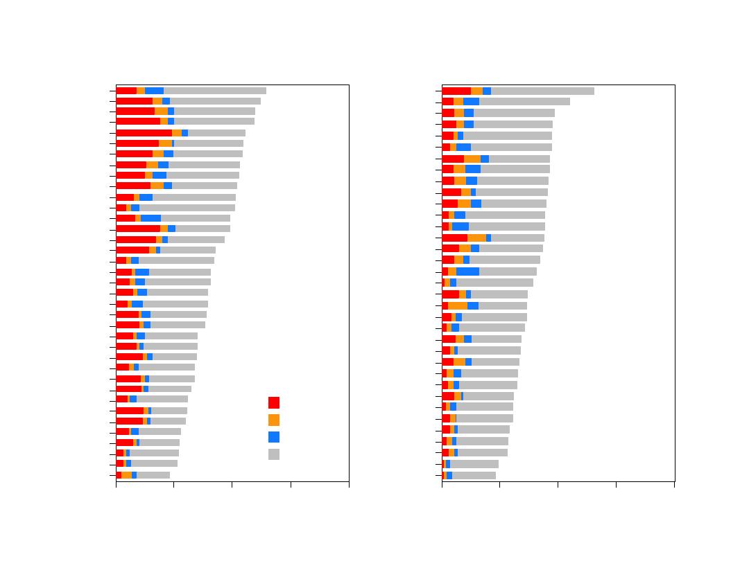
POL-WAR
LTU-KAU
RUS-NOC
UNK-GLA
FIN-NKA
RUS-NOI
RUS-MOC
CZE-CZE
YUG-NOS
RUS-MOI
BEL-CHA
FRA-LIL
POL-TAR
FIN-KUO
UNK-BEL
FIN-TUL
FRA-STR
GER-EGE
ITA-FRI
GER-BRE
BEL-GHE
USA-STA
DEN-GLO
GER-AUG
SWE-GOT
NEZ-AUC
ITA-BRI
AUS-NEW
CAN-HAL
SWI-VAF
ICE-ICE
SWE-NS
SWI-TIC
AUS-PER
FRA-TOU
SPA-CAT
CHN-BEI
0
500
1000
1500
2000
Annual mortality rate per 100 000
CHD
Stroke
Other CVD
Non CVD
Men
UNK-GLA
POL-WAR
LTU-KAU
USA-STA
DEN-GLO
BEL-CHA
RUS-NOC
YUG-NOS
CZE-CZE
UNK-BEL
RUS-MOC
BEL-GHE
GER-EGE
RUS-NOI
RUS-MOI
NEZ-AUC
POL-TAR
FRA-LIL
AUS-NEW
CHN-BEI
CAN-HAL
GER-BRE
FIN-NKA
SWE-GOT
FIN-KUO
ITA-FRI
GER-AUG
FIN-TUL
FRA-STR
ICE-ICE
AUS-PER
ITA-BRI
SWE-NS
FRA-TOU
SPA-CAT
0
250
500
750
1000
Annual mortality rate per 100 000
Women
G3

Component bar chart:
It is a type of charts based on
proportion.
A bar chart that shows the component parts
of the aggregate represented by the
total
length
of the bar.
It uses bars that are either
shaded or colored
to show the relative contribution of each of its
components
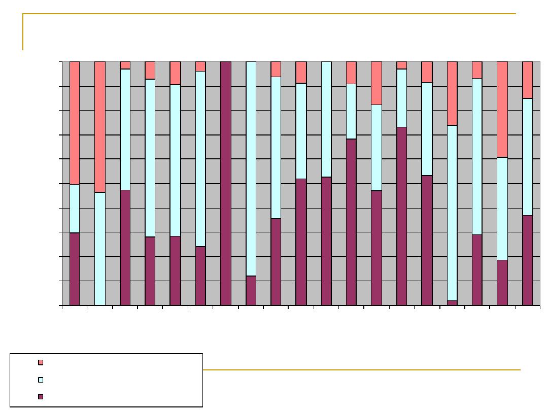
Fig 9: Reason for unvaccination for unvaccinated children
by governorates
0%
10%
20%
30%
40%
50%
60%
70%
80%
90%
100%
B
ag
hd
ad
A
nb
ar
B
ab
yl
on
W
as
si
t
B
as
ra
h
N
in
ev
ah
M
is
sa
n
Q
ad
is
iy
a
D
iy
al
a
K
er
ba
la
Ta
am
em
M
ut
ha
na
Th
i q
ar
N
aj
af
S
al
ah
A
l d
in
S
ul
ei
m
an
iy
a
E
rb
il
D
uh
ok
To
ta
l
Governorates
% of other causes
% of the child abscent
% of not visited by vaccination team

Pie chart:
This is a graphical presentation of the
(relative) frequencies
or magnitudes by
a circle whose area represent the total
frequency and which is divided into
segments which represent the proportional
composition of total frequency.

Pie chart
It is mostly used in presentation of
qualitative data.
It is a type of charts based on
proportion
It uses
wedge-shaped portions
of a circle to illustrate
the relative contribution of each part to the total
(division of the whole into segments).
To demonstrate the angle of each wedge , we
multiply
the relative frequency of each division
by
360
degrees.
Start at 12
o’clock,
It is preferable to arrange segments in order of their
magnitude (starting with the largest), and proceed
clockwise
around the chart.
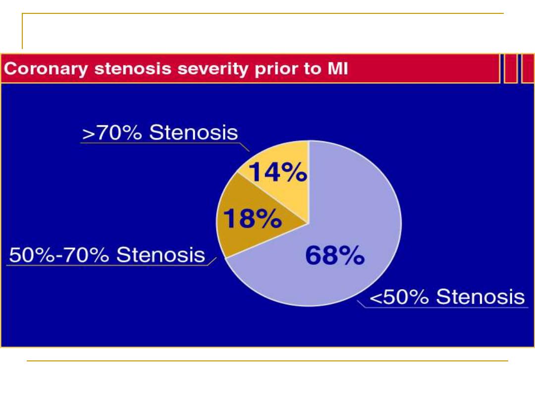
Most Myocardial Infarctions Are Caused by Low-Grade
Stenoses
Pooled data from 4 studies: Ambrose et al, 1988; Little et al, 1988; Nobuyoshi et al, 1991; and
Giroud et al, 1992. (Adapted from Falk et al.)
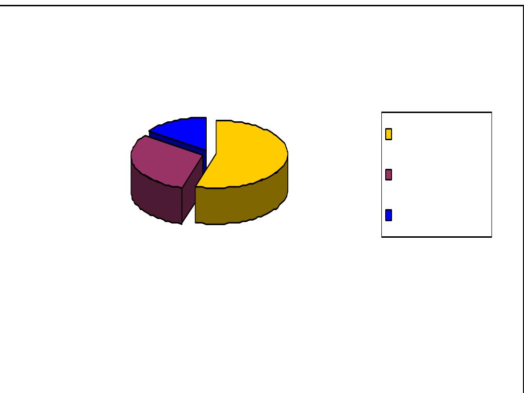
Bar chart shows the distribution of the study sample
regarding their smoking status
186
104
50
Smokers 54%
Non Smokers 31%
Ex-Smokers 15%
Time series graph:
A time series graph displays data that are observed
over a given period of time.
From the graph, one can analyze the behavior of the
data over time
.

Picto-gram ((Picto-chart)):
This is a graphical representation of the
(relative) frequencies
by using symbols
(drawing or picture) relevant to the subject
matter.
Symbols of different size should not be used.
A unit value of the data should be represented
by standard symbol which may repeat to
represent magnitude, Each symbol represents
a
fixed
number of units.
Pictograms

♀♀♀♀♀
0
Parity
♀♀♀♀♀♀♀
1-3
♀
≥4
Fig. Pictogram, No. of mothers (all ages) in 100, 000.

Map charts:
These are used to present the
geographical
distribution
of one or more sets of data

#
#
#
#
#
#
##
#
#
#
#
#
####
#
#
#
#
##
#
#
#
#
#
#
#
##
#
#
#
#
#
#
#
##
#
#
#
#
#
#
#
#
#
#
##
#
#
##
#
#
#
#
#
#
#
##
#
#
#
#
#
#
#
#
#
#
#
##
##
#
##
#
#
#
#
#
# #
Non polio AFP rate and wild virus in EMR, 01/01/2006 - 22/10/2006
0 - 0.74
0.75 - 0.99
1 +
#
= 1 wild virus case
Non EMR areas

Flow chart
It is used to illustrate the
sequence of a
series of events.
It is characterized by
multiple arrows
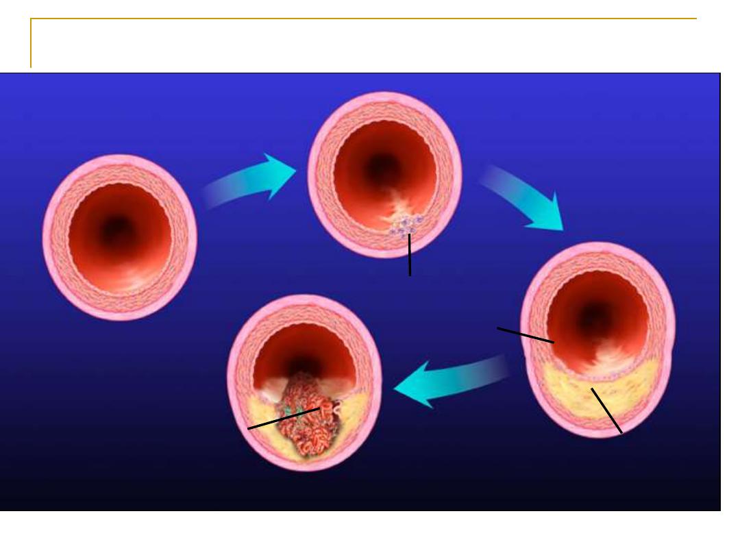
Development of Atherosclerotic Plaques
Normal
Fatty streak
Foam cells
Lipid-rich plaque
Lipid core
Fibrous cap
Thrombus
Ross R. Nature. 1993;362:801-809
.
(Adapted from Glagov et al.) Glagov et al, N Engl J Med, 1987.
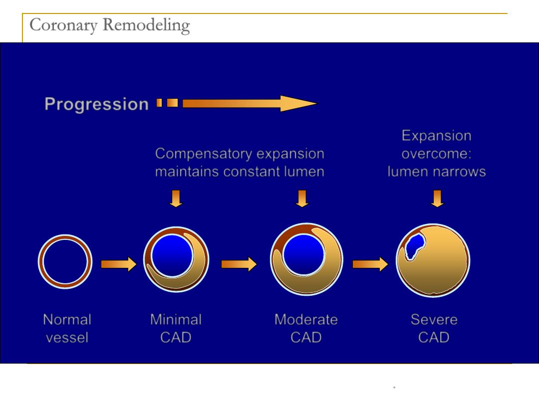
Coronary Remodeling
Normal
vessel
Minimal
CAD
Progression
Compensatory expansion
maintains constant lumen
Expansion
overcome:
lumen narrows
Severe
CAD
Moderate
CAD

Suggestions for the design and use of
tables, graphs, and charts
Choose the method
most effective
for data
and purpose
Point out
one idea
at a time
Limit the amount of data and include
one kind
of data
in each presentation