INTRODUCTION TO Medical STATISTICAL
Learning Objectives of this session
what is meant by statistics?.
Importance of statistics in Medicine
Types of variables (qualitative and quantitative variables).
what is meant by descriptive statistics and inferential statistics?
Presentation of Data
What is Meant by Statistics?
Statistics is the science of collecting, organizing, presenting, analyzing, and interpreting numerical data for the
purpose of assisting in making a more effective decision.
• Biostatistics: data are concerned with medical & biological information.
Importance of statistics in medicine
Statistics is important for:
1. Planning, conducting , and interpretation of medical research .
2. Understanding and Evaluating medical literature
3. Definition of normal, what is the normal value? & what is the abnormal value ?
4. Studying the reliability of laboratory tests.
5. Studying the effectiveness of treatment.
Definitions
Data: are measurements or observations.
A datum (singular) is a single measurement or observation .
A data set is a collection of measurements or observations.
Population: A population is the set of all possible individuals, objects, or measurements of interest in a particular
study (the largest collection of any thing, if this collection has limits this is finite population, if not this is infinite
population)
Sample: A sample is a portion, or part, of the population of
interest.
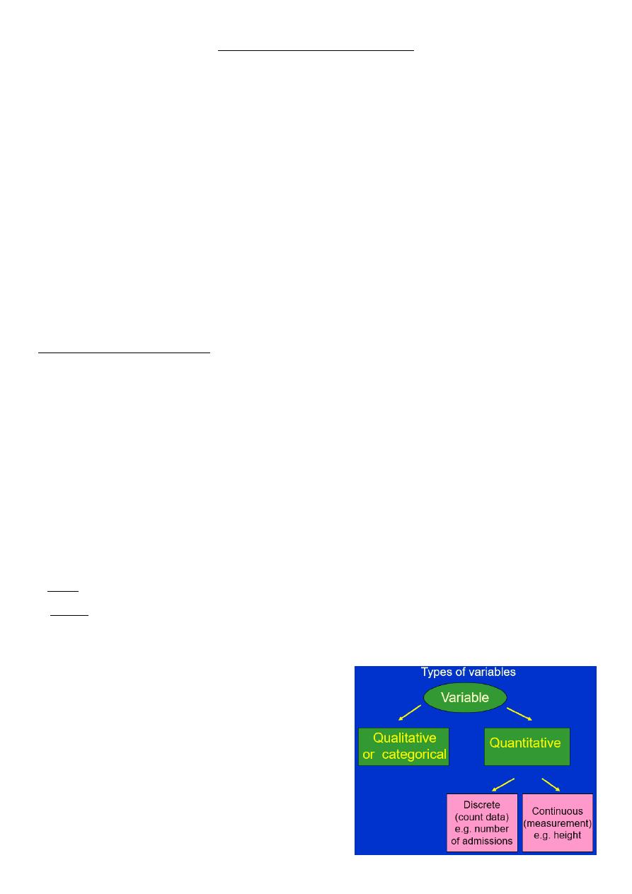
• VARIABLE: is a characteristic that takes different values
in different persons, places or times (i.e. a characteristic
that varies among the persons, places, or objects being
studied)..
Examples: Gender, SES, intelligence, age, blood urea, height,
weight etc.
They may be classified into two Types as follow:

Types of Variables
I.
Qualitative Variables
Variables which can't be measured in usual sense but can be described
Also called categorical variables
Examples: Gender , ethnicity, religious affiliation, blood group.
II.
Quantitative Variables
• Variables that can be measured
• variables that have numeric value
• e.g. age, height, blood urea, etc.
Quantitative variables can be subdivided into two types:
1. Discrete - characterized by gaps or interruptions in between the values (i.e. can't assume fraction like 2.3
persons).
• -counts, how many
Example: number of children in a family, No. colds in last 12 months, the number of bedrooms in a house, Age
last birthday
2. Continuous –variables that don’t have gaps or interruption ,i.e can take on any value (for e.g. we can say the
weight is 25.8 kg).
.- measurements, how much
Example: weight, height, serum cholesterol , BP, Age.
Measurement is the process of assigning numbers to the characteristics being studied. There are some well-known
rules for assigning numbers to variables.
Scales of Measurement
SCALES used to measure variables include:
1. Nominal Scale
2. Ordinal Scale
3. Interval Scale
4. Ratio Scale
NOMINAL SCALE
• NOMINAL SCALE : each measurement is assigned to limited numbers of unordered categories & fall in only
one category (i.e. the information of an individual put the individual in one category only, e.g. gender,
religious affiliation & blood groups)..
• variables measured on nominal scales are also called categorical .
ORDINAL SCALE
• In ORDINAL SCALE: each measurement is assigned to one of a limited number of categories that are ranked
in a graded order. Differences among categories are not necessary to be equal & often not measurable.
• Involves data that may be arranged in some order, but differences between data values cannot be
determined or are meaningless.
ORDINAL SCALE CONT… …
Examples:
• Socioeconomic Status
1 = Low
2 = Middle
3 = High
• Health Status
1 = Poor
2 = Fair
3 = Good
4 = Excellent
INTERVAL SCALE
• In an interval scale: each measurement is assigned to one of unlimited number of categories that are equally
spaced with no true zero point, i.e. it does not begin from zero due to the presence of minus numbers, e.g.
temperature.
• However, ratios of magnitudes are not meaningful (You can say that 100
0
F is warmer than 50
0
, but you
cannot say that 100
0
F is twice as hot as 50
0
F.)
RATIO SCALE
• A Ratio scale is the most precise level of measurement. Measurements begin at true zero point & the scale
has equal intervals Differences and ratios are meaningful for this level of measurement.
• EXAMPLES: money, height , Weight, blood pressure

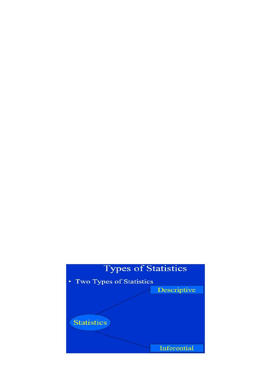
Statistics divided into:
1. Descriptive statistics: concerned with methods & procedures of collection, organization, classification, and
summarization of data, giving only descriptive data.
2. Inferential Statistics: concerned with making inference about a population based on a sample i.e make a
decision, estimate, prediction, or generalization about a population, based on a sample.
Descriptive Statistics Summarization and Presentation of Data
PRESENTATION OF DATA can be:
I.
Tabular: using tables.
II.
Graphical: using graphs.
III.
Pictorial: using pictures or charts.
IV.
Mathematical: a) Measures of central tendency
b) Measures of dispersion.
Tabular presentation
How to Construct a Frequency Distribution
1. Decide about the number of classes .
2. Estimate the width of class intervals
STURGE'S RULE: used to decide the number & width of class intervals:
K = 1 + 3.322 log n & W = R / K
Where K = no. of intervals
N = no. of observations = total no. of measurements
W = width of intervals
R = the range of readings = largest value (L) – smallest value (S)
3. Determine the lower class limit for the first class by selecting a convenient number that is smaller than the
lowest data value.
4. Determine the other class limits by repeatedly adding the class width (from Step 2) to the prior class limits.
5. Tallying can be used to calculate numbers ( denote any observation against the group as a stroke)
Example:
• weights of malignant tumors removed from the abdomen of 57 subjects: 68, 63, 42, 27, 30, 36, 28, 32, 79,
27, 22, 23, 24, 25, 44, 65, 43, 25, 74, 51, 36, 42, 28, 31, 28, 25, 45, 12, 57, 51, 12, 32, 49, 38, 42, 27, 31, 50,
38, 21, 16, 24, 69, 47, 23, 22, 43, 27, 49, 28, 23, 19, 46, 30, 43, 49, 12.
• Solution:
• K = 1 + 3.322 log (57) = 1 + 3.322 (1.7559) = 7
• W = R / K = (79 – 12) / 7 = 9.6 ≈ 10
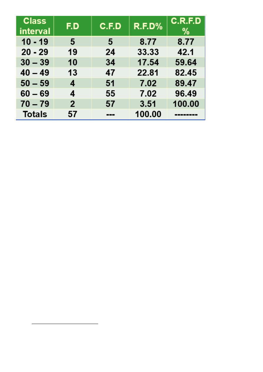
Relative Frequency
• The Relative frequency : is the percentage of number of observations in each class out of the total number
of observations.
Number of observations in each class interval
R.F =------------------------------------------------------ x 100
• Total number of observations
• It is important for the comparison between two distributions having different totals.
Cumulative Frequency: it is the number of observations in each class plus the total number of observations in the
preceding classes
Cumulative Relative Frequency : it is the percentage of the accumulated frequencies in each class out of the total
number of observations ( giving the percent of all observations that occurred up to and including that class).
• An Alternative: add the relative frequencies for each class instead of the raw frequencies.
The class interval :
Should be continuous to each other.
Should not be overlapped, i.e. not 0-10, 10-20,20-30 .
Each class interval has the same “class width”.
Each item in a particular class is considered to be approximately equal to the “class midpoint”;that is, the
average of the two “class boundaries”.
Should include the smallest & largest values in the study sample.
II.
Graphical Presentations of data
Graphical presentations of data may aid the reader to pick up the most important idea by just looking to the
graph.
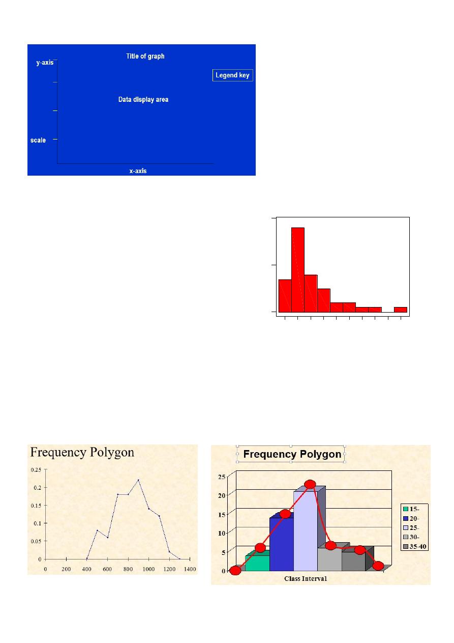
Graphical display components
1. Histogram: It is presented as rectangles, the
width represents the class interval , its height
represents the frequency. The rectangles are
continuous adjacent to each other
– since intervals are usually equal, the
widths are equal
– If widths are changed then heights are
altered such that the area under the
histogram is constant (unchanged)
Histogram is used for continuous quantitative variable
& for only one set of data.
2. Frequency polygon: it is similar to histogram in its use for quantitative variable but polygon can be used for
2 or more sets of data & this is an advantage of this polygon in facilitating comparisons. It can be constructed
from histogram by taking the midpoint dot of each rectangle (class interval). Especially useful for presenting
data from several samples in one diagram
40
60
80
100 120 140 160 180 200 220
0
10
20
SysVol
F
re
q
u
e
n
c
y
Heart Attack Patients
Histogram of End-Systolic Volume for 45 Male
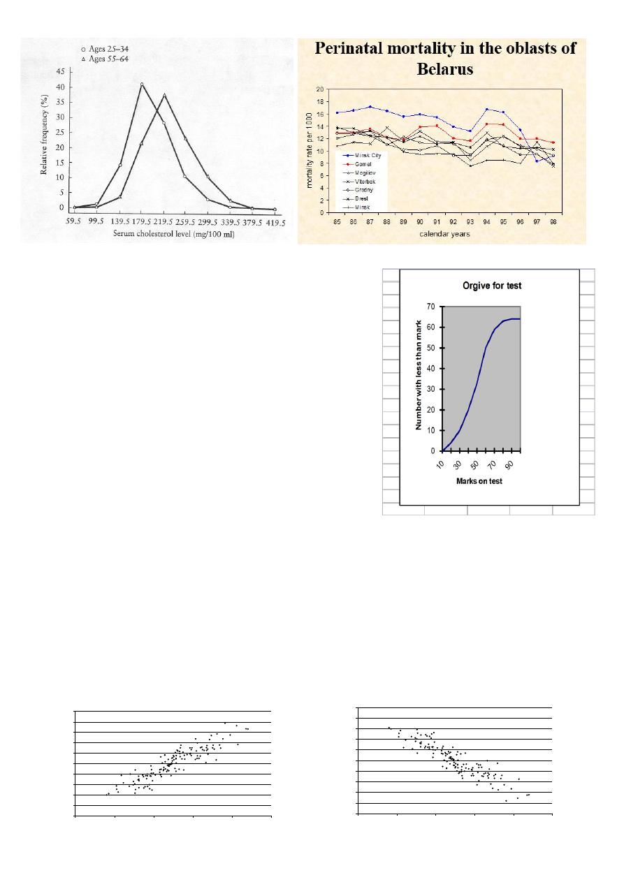
3.Ogive (Cumulative Frequency Polygon):
An ogive is a plot of the cumulative frequency distribution .
The ogive is always an increasing graph which eventually flattens off
The ogive is good for measuring the median and other percetiles
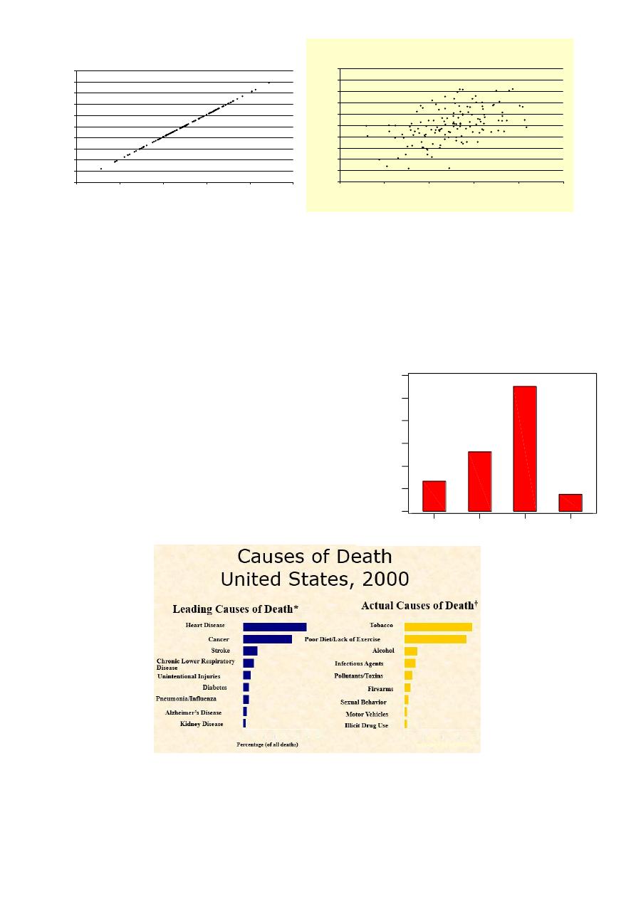
4.Scatter-plot (diagram)
A general form of bivariate plot , showing the joint distribution of two variables
A scatter diagram displays the relationship between two continuous variables
Useful in the early stage of analysis when exploring data and determining is a linear regression analysis is
appropriate
May show outliers in data
Positive Relationship
0
10
20
30
40
50
60
70
80
90
100
0
20
40
60
80
100
Variable B
V
a
ria
b
le
A
Negative Relationship
0
10
20
30
40
50
60
70
80
90
100
0
20
40
60
80
100
Variable B
V
a
ria
b
le
A
Frequency curve
If the class intervals are made smaller and smaller while, at the same time, the total number of items in the data is
increased more and more, the points of the frequency polygon will be very close together. The smooth curve joining
them is called the “frequency curve”
III. PICTORIAL PRESENTATION OF DATA (Charts):
1.Bar chart: it is used for discrete quantitative variables and
qualitative variable. The bars are constructed to show the
frequency or relative frequency for each category of the variable
on Y-axis, while X-axis is for qualitative & discrete values. It is
important that Y axis should start at zero.
Bar chart is represented as separated rectangles. Width
of bars , the horizontal spaces between bars ,and the
ordering of the bars are chosen for convenience
Only heights of bars are important
Bar chart can be used for more than 1 set of data.
2. Component bar chart (stacked bar chart): use shaded or colored bars to show the contribution of different
components of each variable.
Perfect Relationship
0
10
20
30
40
50
60
70
80
90
100
0
20
40
60
80
100
Variable B
V
a
ria
b
le
A
Moderate Relationship (r = .50)
0
10
20
30
40
50
60
70
80
90
100
0
20
40
60
80
100
Variable B
V
a
ria
b
le
A
Pharmacists
Nurses
Doctors
Dentists
6000
5000
4000
3000
2000
1000
0
Profession
N
u
m
b
e
r
o
f
w
o
rk
e
rs
Bar chart for number of health professionals
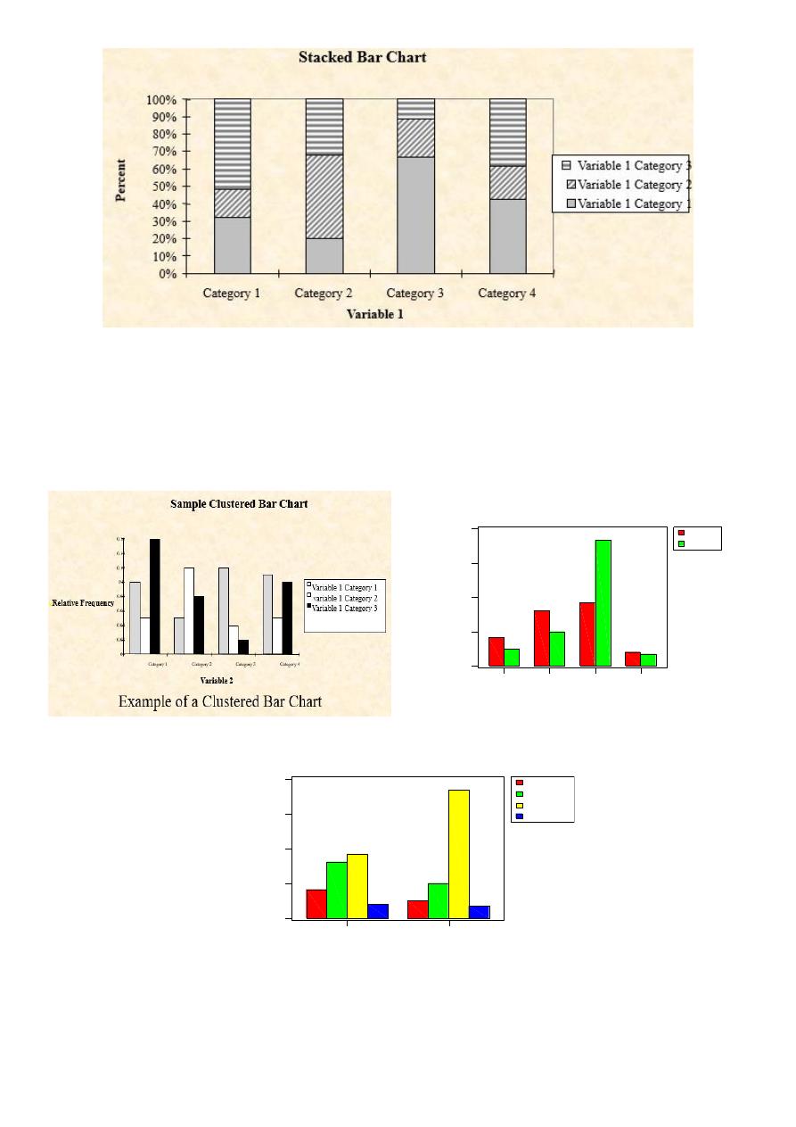
3.Clustered Bar Chart
In a Clustered Bar Chart, the bars for one variable are grouped according to the values of the others qualitative
variables.
Private
Public
Dentists
Doctors
Nurses
Pharmacists
0
1000
2000
3000
4000
Profession
N
u
m
b
e
r
o
f
w
o
rk
e
rs
Clustered bar chart for number of health professionals
Dentists
Doctors
Nurses
Pharmacists
Private
Public
0
1000
2000
3000
4000
Sector
N
u
m
b
e
r
o
f
w
o
rk
e
rs
Clustered bar charts of number of health professionals
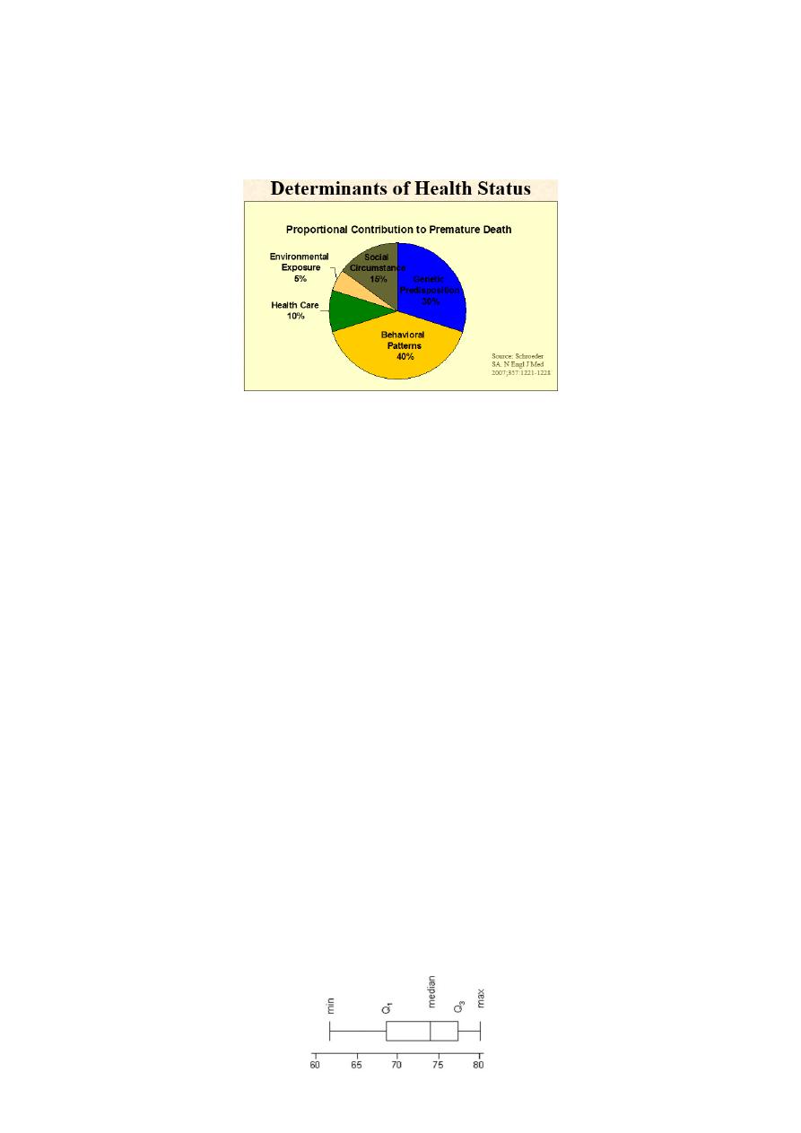
4.Pie Diagram (chart): it is a circle divided into sectors with areas proportional to the frequencies or the relative
frequencies of the categories of the variable. It is used for one set of data.
To represent the data as pie chart we must :
Find the relative frequency distribution of each category (i.e. % of each variable).
Multiply the relative frequency distribution by 360o to find the degree of each category.
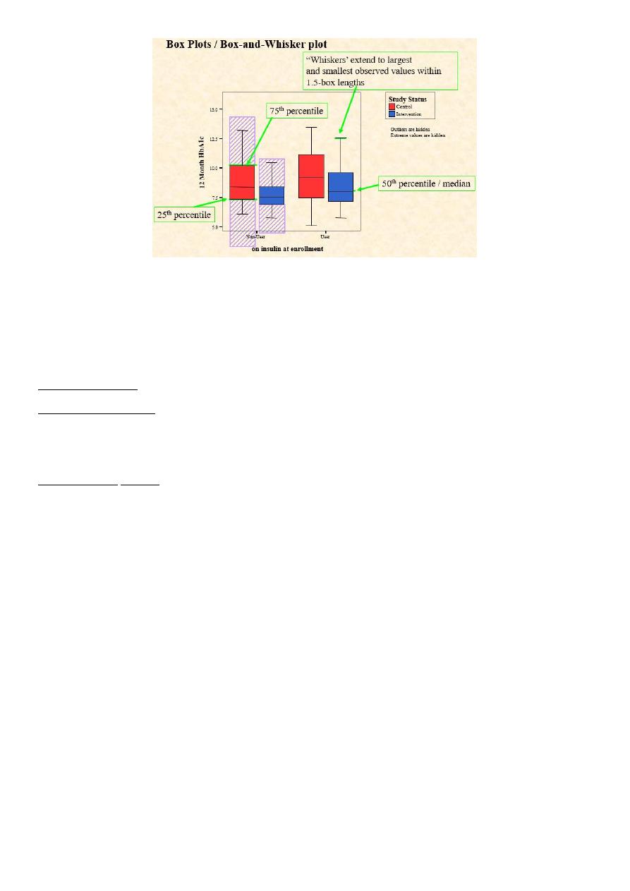
5. Boxplots (Box and Whisker Diagrams):
A box plot is a simple graphical summary of continuous quantitative data.
Box plots can quite usefully display the essential features of many samples in one chart.
It gives a useful idea of the sample distribution( shows prominent features like location, spread, skewness
and outliers).
A box-plot is a visual description of the distribution based on
Minimum
Q1
Median
Q3
Maximum
Useful for comparing large sets of data
In the box plot:
The box represents the interquartile range. The line across the box indicates the median.
The "whiskers" are lines that extend from the box to the highest and lowest values, excluding outliers.
If the box is closer to the lower whisker, the data are probably skewed towards the lower end of the scale. If
the box is closer to the upper whisker, the data are probably skewed towards the higher end of the scale.
If the box is in the middle of the whiskers, the data are probably more evenly distributed
Box-plot
5.Pictogram: it uses a series of small identifying symbols to present the data, each symbol represent a fixed no. of
limits.
6. Map chart: geographical distribution illustrated by symbols over a map.
Presentation of data
Benefits of Using TABLES
more accurate than graphs
more concise than graphs
Benefits of Using GRAPHS
provide good general overview
allows reader to visualise the concept
Things to keep in mind when completing the results section of your paper:
1.Any table or graph should include a title that clearly states what is included in the table.
2. In any graph , it is essential to clearly label the axes so that the reader knows how to read the data being
presented.
3. Don’t include graphs just for the sake of having more graphs. Some projects may not use any graphs, others will
use several.
4. Tables and graphs should include only information that is relevant for seeing (this is the information the
researcher wants to convey).
5. If you make adjustment with your data, you should explain it in the text. It is important to document why you may
exclude outliers in the text of your paper
6. The table shouldn’t include too much information.
7. The important thing is that the tables and graphs are clear and easy to the reader .The table should be well
organized.
Thank you