37
Lecture 5 - Graphing Data
SPSS has the capability to create many types of charts as can be seen by clicking on the
Graphs menu bar. Graphs can also be created by using options available in some dialog
boxes for analyses. For example, histograms can be created from the Graphs menu or
from Analyze/ Descriptive Statistics/Frequencies
.
.
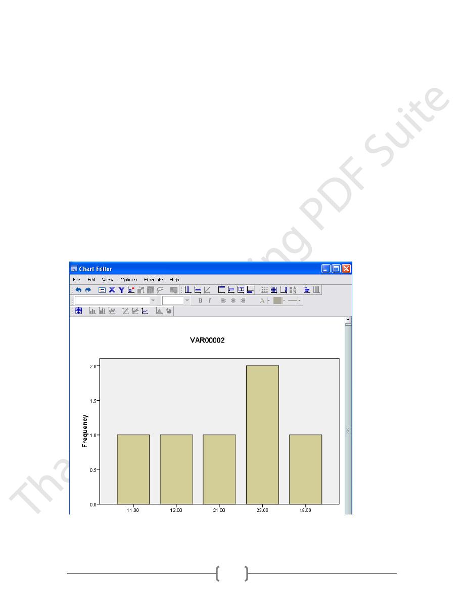
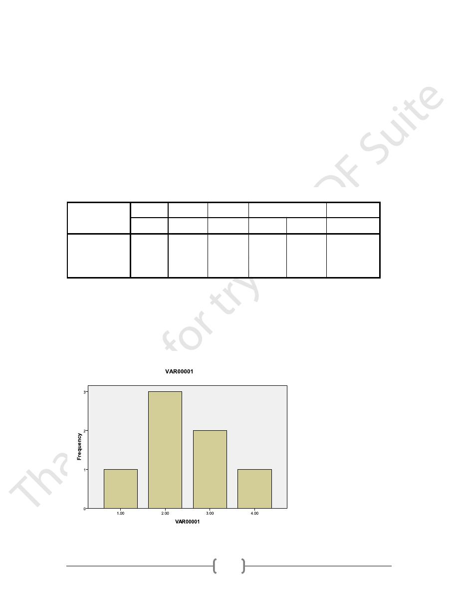
Frequency Distributions
Frequency distributions plot the number of occurrences or counts for each value of a
variable.
To edit the graph, double click on it and the Chart Editor view will open. The Chart
Editor has several Menu bars and Icons. Take a moment to review them by clicking on
the menus and reading the commands that appear and putting your cursor over the icons
and reading the descriptions that appear to the bottom left hand corner
38
Double click the labels under the bars, and a dialog box will appear.
To label the actual frequency value inside the bars, click on the Bar Labels Style Icon
and select the style you like. Click OK.
To change the color of the bars, single click the mouse when the cursor is over one of the
bars, then click the Color Icon
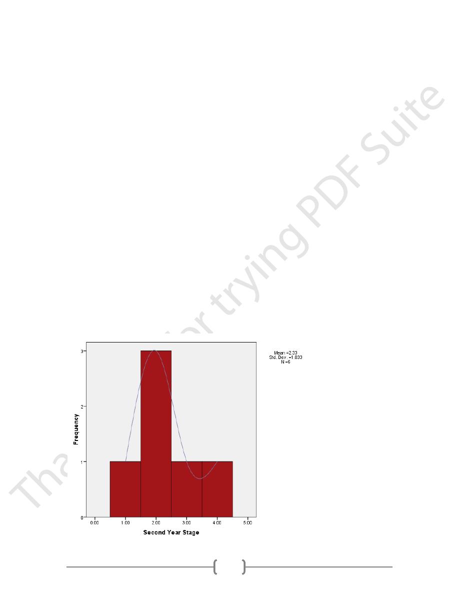
Histograms
As noted in the textbook, histograms are essentially a frequency distribution for ranges of
values rather than individual values. These are ideal when there are several values and
relatively low frequencies for each.
Select Histogram under Graphs.
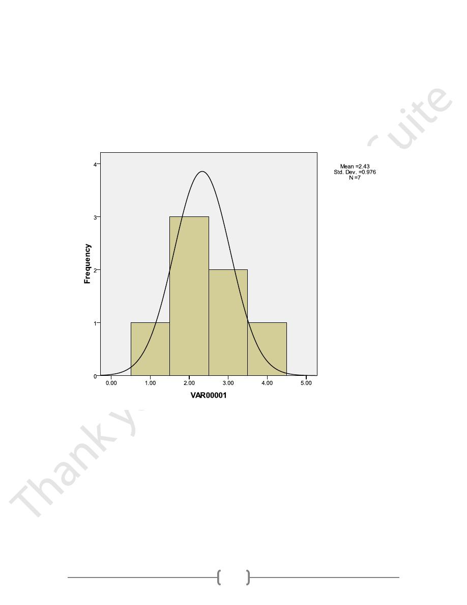
Select grade point average for Variable. Check Display the normal curve if you want
to see if the distributions is approximately normal. Then, click Ok
SPSS will select value ranges for you. If you want to change the ranges, double click
on the values along the X axis. I like the way they are.
Add a title for the Y axis as you did before. Double click the area, then type Frequency
for the Axis Title, select the type of Title justification you want, and click Ok. The
resulting graph will look like this.
39
Histogram
To add a title to your chart, click Title under the Chart Menu.
To edit the title, click in the Axis Title box and begin typing. I like my labels to be
capitalized, so I’ll change it to “Social Problems in 9
th
Grade.” I like titles to be centered, so
don’t change the title justification, but click on the arrow and look at the other options. Then,
click Labels to change the bar or category labels. Another dialog box will appear.
Notice, you can specify that SPSS show all value labels or intermittent labels. Select All
labels since there are only 2 categories. (If you had many categories, showing all labels
might make things unreadable.) Then, to edit the Label Text, highlight the label you want to
change and then type in the box named Label. I will change the labels to a simple Yes and No
since the variable label clarifies what Yes and No mean. Click change after you edit each
one. Also, take a moment to view the options under Orientation. Select whichever one suits
you. Then click Continue, which returns you to the previous dialog box, where you can click
OK.
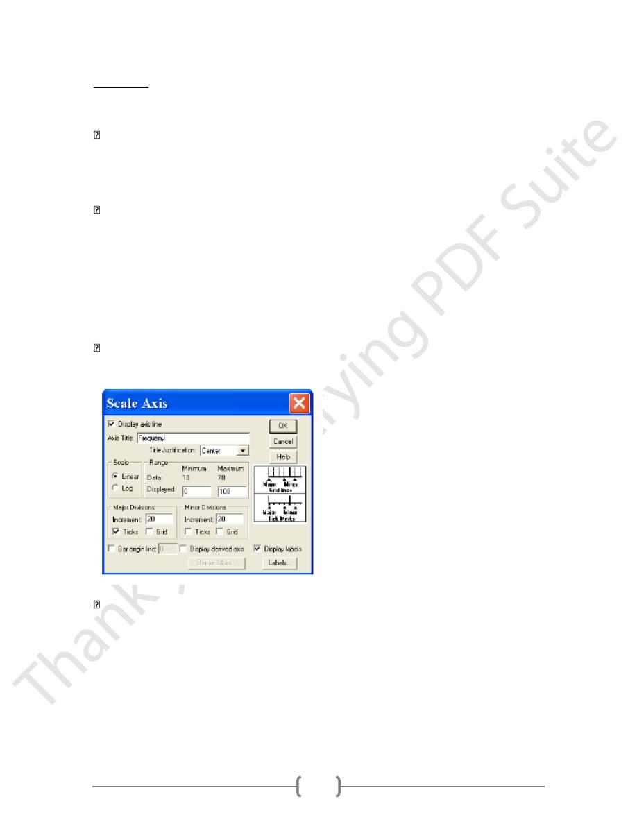
I’d also like to change the Y axis to read Frequency rather than Count and to change the
scale. To do this, double click on “Count” to activate the dialog box.
Type Frequency in the Axis Title box, and select the type of Title justification you want.
Then, in the box for Major Divisions, change it to 10 to alter the scale. Then click Labels
and change the number of decimal places to 0. Click Continue and then Ok.
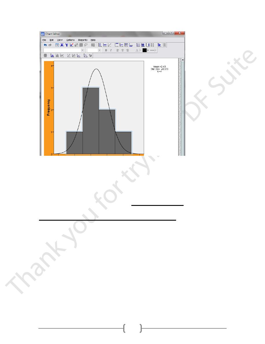
To label the actual frequency value inside the bars, click on the Bar Labels Style Icon
and select the style you like. Click OK.
To change the color of the bars, single click the mouse when the cursor is over one of the
bars, then click the Color Icon.
40
Descriptive Statistics: Measures of
Variability and Central Tendency
Descriptive statistics are calculated using the Analyze menu. Most are calculated using
either the Descriptives or Frequencies command under Descriptive Statistics.
In the Analyze menu, select Descriptive Statistics and then Descriptives
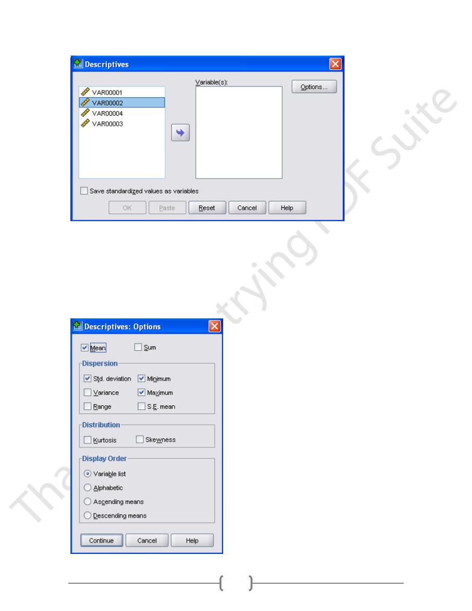
41
Select each of the continuous variables by either double clicking them, which
automatically puts them in the Variable list, highlight them one at a time by single
clicking them and then clicking the arrow to shift them into the variable list, or by
holding the control key down while highlighting all of the variables of interest and then
shifting them into the variable list all at once by clicking the arrow. Then click Options.
42
Select each of the measures you’ve been learning about (Mean, Std. deviation, Variance,
Range, Minimum and Maximum). Then, select the Display Order you would prefer. This
will determine the order they appear in for the resulting table. I like them in the order I
indicated in the Variable list. Then click Continue
In the main descriptives dialog box, check the box that says Save standardized values as
variables. SPSS will calculate z scores for each of the variables using the formula you learned
about and append them to the end of your data file. Click Ok. The resulting output will look
like this. Note that the variable labels are used rather than the variable names. Remember,
we specified this as the default in Edit/Options/Output Labels.
Descriptive Statistics
N
Minimum
Maximum
Mean
Std. Deviation
Statistic
Statistic
Statistic
Statistic
Std. Error
Statistic
VAR00001
7
1.00
4.00
2.4286
.36886
.97590
VAR00002
7
10.00
50.00
28.5714
5.94762
15.73592
Valid N (listwise)
7
Double click the table so you can edit it. As was the case with graphs, SPSS has many options
to edit statistics in tables as well. Let’s try some of them
Frequencies
43
Histogram
As before, you can edit the tables or the graphs by double clicking on them. One difference
we have seen between the Descriptives and Frequencies options is that descriptives only
include mean for measures of central tendency whereas Frequencies include the mean,
median, and mode. Further, Descriptives does not have any built in graphing options, but
Frequencies does.